Skip to content
Difficulties Stats
A 23%
B 32%
C 25%
D 16%
E 3%
Note: “A” images are the hardest, “E” the easiest
The Best Versions Were Corrected By
Andrea Baldini Andrea Cesarini Doug Schafer Werner Tschan Emanuele Diviso Claudio Stefanini Alessandro Nucci Piersimone Fontana Daniele Castellani Bogdan Grec Enrico Oggioni Daniele Bianco Bill Bane Fabio Mannucci Fabrizio Cacopardo Giuseppe Aielli Luca Negri John Furnes Andrea Re Maurizio Danese Fulvio Bosco Tom Hurd Massimo Arici Andrea Iodice Francesco Paolo Albano Gianluca Bacca Enrico Busi Van Brollini Steve Jordan Matteo Bruni Jeremy Perez Maurizio Lanciotti Matteo Camarota Bob Graham Jr Marco D'Amico Andrea Salini Silvano Marcon Ludwig Thalheimer Francesco Butano Willy Di Giulian Davide Barranca Aimee Armour Avant Gianni Romano Andrea Danna David Bruni John Farmer Michael Demyan Calvin Jones Simone Sirgiovanni Andrea Spognetta Roberto Pelloni Damiano Busti Antonio Biggio Maurizio Secundo Ottavio Montanari Roberto Freddi Andre Baldini
Legend: below each photo are the Codename, : difficulty, : number of versions, : year we worked on.

# 614 badtrio A

# 613 snowypark B

# 612 movieposter B

# 611 girlwithahorse A

# 610 darkcoffee A

# 609 gateportrait B

# 608 threesheeps A

# 607 mountaintop B

# 606 proportrait2 C

# 605 proportrait C

# 604 hazylight B

# 603 toodark A

# 602 hardcolors A

# 601 blackandwhitegate C

# 600 stillshadows A

# 599 inthemosque B

# 598 hotairballons B

# 597 pitchblack A

# 596 playingoutside D

# 595 portraitwithflowers B

# 594 tinylake B

# 593 dronewedding C

# 592 windowsportrait A

# 591 rosesbridesmaid B

# 590 backwedding A

# 589 faintcolors C

# 588 allyellowtones D

# 587 rainydaymemory A

# 586 aharddaysnight C

# 585 bougainvilleportrait B

# 584 diveinthelake B

# 583 badpalette A

# 582 skatingdown B

# 581 seacabin E

# 580 poolportrait2 C

# 579 scarfportrait D

# 578 wrongcolors B

# 577 infrontofacab A

# 576 shadesofcolor D

# 575 louvreportrait2 A

# 574 blackwhitepoint A

# 573 mistymountains D

# 572 alltheplanes C

# 571 lyingonthecouch A

# 570 subtlebandw C

# 569 bluescarf B

# 568 curlyportrait B

# 567 controluce3 A

# 566 sunsetwedding C

# 565 antwerpcentral D

# 564 theaviator2 C

# 563 loudportrait A

# 562 badchroma A

# 561 dusksands B

# 560 shapestheory D

# 559 blackportrait A

# 558 irishlighthouse E

# 557 graywaterfall D

# 556 redroomportrait A

# 555 moonmountains B

# 554 aqualuna D

# 553 doublestart A

# 552 chinesepond B

# 551 parkingportrait C

# 550 loungeview D

# 549 blackdressonsteps B

# 548 lightsmatch B

# 547 chineseshop A

# 546 distantvalley B

# 545 upthehill B

# 544 simpleportrait C

# 543 sandyelephant A

# 542 thesenewtools D

# 541 lackofdepth B

# 540 gardenportrait D

# 539 baltimore23 A

# 538 onemorebw C

# 537 blackandwhitebalcony D

# 536 impossibleportrait A

# 535 blondeonyellow C

# 534 portraitinred C

# 533 teacherportrait B

# 532 colonnadeportrait C

# 531 phinthewoods D

# 530 highkeyportrait A

# 529 lowkeyportrait B

# 528 ivyportrait B

# 527 messylandscape B

# 526 verydarkportrait C

# 525 verybrightportrait B

# 524 theowlet B

# 523 barportrait B

# 522 skyreplacement2 D

# 521 flowersmodel2 A

# 520 flowersmodel B

# 519 foreignwedding B

# 518 climbatdawn C

# 517 climbatsunset D

# 516 insidewaterfall A

# 515 poolparadise C

# 514 whiteandblack A

# 513 blackandblack C

# 512 texanwedding B

# 511 aerialshot C

# 510 hikeonthelake C

# 509 seniorportrait A

# 508 lessbutmore D

# 507 dancerinstudio C

# 506 strongblues B

# 505 stronglights B

# 504 sunsetgradient D

# 503 duomodibolzano C

# 502 hatportrait B

# 501 polydress D

# 500 thisis500 E

# 499 wedgeometry C

# 498 monumentvalley B

# 497 peltportrait D

# 496 brightgarden C

# 495 badlights A

# 494 mirrormountain B

# 493 jacketad A

# 492 flowersportrait B

# 491 truckcommercial D

# 490 mistportrait A

# 489 fallwedding B

# 488 chillwedding B

# 487 theflycatchter C

# 486 stbasilportrait B

# 485 skintones A

# 484 lionesslandscape B

# 483 coupleoncouch A

# 482 colorseparation D

# 481 carportrait B

# 480 zebrahead D

# 479 farburger C

# 478 carrerpetritxol A

# 477 pinkportrait C

# 476 orangepaint A

# 475 sunsetatsea B

# 474 rockyroad E

# 473 louvreportrait B

# 472 withreflection E

# 471 waterfallportrait D

# 470 thevillage B

# 469 pratincole C

# 468 threelayers D

# 467 mountainlake C

# 466 brideandperfume B

# 465 sheepportrait B

# 464 hardangerbridge D

# 463 artdirection B

# 462 bluenight D

# 461 bayaweaver D

# 460 waitingapple B

# 459 italianalley E

# 458 flowervalleycolor C

# 457 blackdress A

# 456 trekkingday D

# 455 controluce2color B

# 454 waterfallvalley C

# 453 intheshadows B

# 452 towerrecords D

# 451 wildhorses A

# 450 youngdeer D

# 449 windowlight C

# 448 thegiraffe B

# 447 lakepowell A

# 446 controluce2 B

# 445 skyreplacement C

# 444 sideportrait B

# 443 lackofinterest D

# 442 shadowrestore A

# 441 fadetoblack B

# 440 roseonrose D

# 439 poolportrait A

# 438 flatlion C

# 437 portraitatdusk A

# 436 twiceonthestairs A

# 435 controluce B

# 434 nightportrait B

# 433 weddingsetup C

# 432 flowervalley C

# 431 vacationtime C

# 430 yellowbackground B

# 429 croptryout D

# 428 stairsportrait C

# 427 canadageese B

# 426 coverportrait D

# 425 intothewild C

# 424 chromaportrait D

# 423 thehandmaiden B

# 422 toriigate C

# 421 doublestudy2 B

# 421 littlebuddha D

# 420 waterfallpark B

# 419 thechiaroscuro C

# 418 bwwedding B

# 417 filteringlight B

# 416 topofthemountain C

# 415 astronight A

# 414 coupleportrait C

# 413 greenparrot B

# 412 longshore C

# 411 portraitongreen D

# 410 blackbridge C

# 409 weddingnight C

# 408 theaviator A

# 407 tullamoredew B

# 406 tokyotower B

# 405 railroadblues E

# 404 happynewyear C

# 403 ladyinpink A

# 402 redshadows B

# 401 empirestate D

# 400 thisis400 D

# 399 brightbeach A

# 398 awalkinbw D

# 397 sharperlynx A

# 396 atthewaterfalls C

# 395 hotforteacher C

# 394 magmaticrocks C

# 393 summerfreckles A

# 392 lightbulbs A

# 391 countryvilla A

# 390 stilthouse A

# 389 theshepherd C

# 388 blackandred C

# 387 flowersonflowers A

# 386 atthewindow B

# 385 inthegarden D

# 384 northerntherms C

# 383 highportrait2 C

# 382 whitepaint C

# 381 watchman B

# 380 catamaran D

# 379 thesinger C

# 378 diningroom B

# 377 sharpnight A

# 376 highportrait1 B

# 375 duskportrait B

# 374 colorvariance3 D

# 373 colorvariance2 D

# 372 windowportrait D

# 371 naturamorta B

# 370 sunsettrain B

# 369 hiresportrait B

# 368 foroncemen C

# 367 wholeportrait A

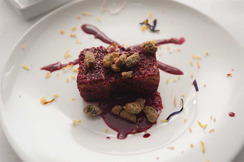
# 366 lemontart B

# 365 hydrangeagirl C

# 364 trainportrait D

# 363 castelsantangelo A

# 362 manarolaatnight B

# 361 darkandstormy D

# 360 movienights C

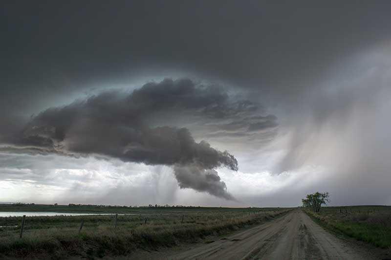
# 359 cattletornado B

# 358 sakuraportrait D

# 357 newyearride C

# 356 foodportrait C

# 355 awalkinthewoods D

# 354 doubleportrait A

# 353 artistportrait B

# 352 backtoblacknwhite E

# 351 italianbride B

# 350 koreanbride B

# 349 easternfishing C

# 348 thejazzman A

# 347 sunsetcatamaran B

# 346 themilkshake D

# 345 shadowportrait C

# 344 sushitime A

# 343 inthedeathcar B

# 342 agirlwithaleaf C

# 341 weddingday B

# 340 sangiovanniranui D

# 339 twogalettes B

# 338 orchidlady D

# 337 kanoradokansas C

# 336 ladyinthesnow A

# 335 singaporebynight C

# 334 lightblinds A

# 333 mountelden C

# 332 arcadeneons E

# 331 eltzcastle B

# 330 opponentcolors C

# 329 sunbreakfast D

# 328 saturnapollo B

# 327 badwaterfall C

# 326 yellowside A

# 325 carandchroma C

# 324 southofwaynoka B

# 323 jewellershands B

# 322 springbbq C

# 321 littlecake B

# 320 marchtheeight B

# 319 goldengatebridge C

# 318 navajostorm C

# 317 lunarrovingvehicle C

# 316 chromaticvariance B

# 315 pomacanthusparu B

# 314 thebigswitch C

# 313 ruinsattwoguns A

# 312 lacarlotta D

# 311 doublestudy A

# 310 navajonation B

# 309 edgardmitchell C

# 308 interiorscene B

# 307 happychristmas B

# 306 colorvariance A

# 305 introducingnasa B

# 304 yellowhills C

# 303 greenbackground E

# 302 familygroup A

# 301 redportrait B

# 300 thisis300 B

# 299 privateinvestigation A

# 298 ladyinblack B

# 297 leatherandrocks B

# 296 widowskimmer D

# 295 mitlittlekid C

# 294 colorsandskin C

# 293 washingthedog D

# 292 introductingmit5k B

# 291 guinnessspring B

# 290 archesparkutah D

# 289 lilacportrait C

# 288 cornelpanther B

# 287 alfaromeogrid B

# 286 gartersnake C

# 285 lackofcolor A

# 284 letsletterpress A

# 283 bntuscany C

# 282 streetmusic2 A

# 281 oneworldtradecenter B

# 280 springishere C

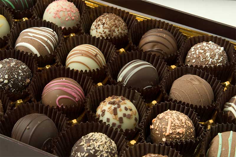
# 279 chocolates A

# 278 boxcanyonpueblo B

# 277 streetmusic1 A

# 276 cimedilavaredo D

# 275 marcodiodato B

# 274 sharpeningtest D

# 273 saguaroatdusk B

# 272 martinastella4 C

# 271 fromgreentoblue B

# 270 thesteak A

# 269 outofdynamicrange C

# 268 christmaskitchen B

# 267 onthelastlap C

# 266 wicklowmist A

# 265 martinastella3 B

# 264 fallinflagstaff C

# 263 ecstasyofgold A

# 262 collinedinorcia D

# 261 yellowexposure A

# 260 ballyvaughan C

# 259 cedarandsail A

# 258 davideportrait B

# 257 grainytango A

# 256 easternwyoming B

# 255 lightshadowmodel A

# 254 movingferrari C

# 253 smoothwhite A

# 252 whitewaterfalls D

# 251 summermilkyway B

# 250 thisis250 A

# 249 chanelglasses A

# 248 arizonaroad B

# 247 blacktango A

# 246 seaexposure D

# 245 zeisslens C

# 244 tangored B

# 243 littlegirlblue A

# 242 thefondue B

# 241 inthekitchen D

# 240 hippotime B

# 239 yellowwedding B

# 238 puntacristallo C

# 237 desertinbloom A

# 236 doublestrike C

# 235 ournextcolors A

# 234 theredpanda C

# 233 blacktango A

# 232 whitedonkey A

# 231 thebluehome B

# 230 thecastle C

# 229 martinastella2 C

# 228 coralwall C

# 227 firstandlastmotel B

# 226 tangomagenta B

# 225 justskinandblack A

# 224 purplecake B

# 223 pilotportrait D

# 222 denverscloud A

# 221 baltimore A

# 220 rolandoandfull B

# 219 goldenportrait B

# 218 ziggy A

# 217 atthepitstop C

# 216 fireplaceportrait B

# 215 wicklow D

# 214 swissairplane D

# 213 ecstasyofgold A

# 212 sanfranciscopeaks B

# 211 oldfriends B

# 210 chefsatwork D

# 209 andreykhludeyev D

# 208 heavyanchor C

# 207 theelephant B

# 206 onpontevecchio A

# 205 timewarnercenter C

# 204 snowleopard B

# 203 oklahomaroad B

# 202 thegreenman A

# 201 liberazione C

# 200 yellowcabs B

# 199 lagrolla B

# 198 thesteak A

# 197 arizonaobservatory A

# 196 glendalough3 D

# 195 attheducatibox C

# 194 glendalough2 C

# 193 glasstiger B

# 192 fromsteve A

# 191 glendalough1 C

# 190 fountain A

# 189 modelandbackground B

# 188 teverefarfa D

# 187 vietnamesebridalmakeup A

# 186 coralreef A

# 185 thewalking D

# 184 myfirstdayofschool A

# 183 modelside C

# 182 coloradohorizon D

# 181 jovanotti D

# 180 bracciano D

# 179 sharpstatue C

# 178 firenzeatnight C

# 177 naturallight A

# 176 toomuchyellow D

# 175 capocaccia C

# 174 onthepodium B

# 173 cremonini C

# 172 sealayers A

# 171 whiteportrait B

# 170 nebraskasupercell B

# 169 umbrellagirls B

# 168 coupleonabridge A

# 167 sunsetcrater B

# 166 visitorcenter B

# 165 picachopeak B

# 164 highkeygreen A

# 163 vietnamesewidow B

# 162 aironecenerino C

# 161 reddress B

# 160 katyline B

# 159 theaccident D

# 158 blackandwhitehouse C

# 157 spoons C

# 156 martinastella C

# 155 goshencountysupercell A

# 154 madalinaghenea D

# 153 theshoal B

# 152 myfirstdog C

# 151 inside B

# 150 whitefurniture A

# 149 thereflection B

# 148 halfuphalfdown A

# 147 wallportrait B

# 146 blackonblack C

# 145 stingray A

# 144 blueeyes B

# 143 fotodiluglio A

# 142 newyearseve A

# 141 happychristmas B

# 140 motocross B

# 139 yertletheturtle A

# 138 doloresoriordan B

# 137 irishzone B

# 136 subsonica A

# 135 thehitter D

# 134 purplecake B

# 133 underwater B

# 132 colorfulportrait B

# 131 chocolates A

# 130 cloudybeach B

# 129 julescluzel D

# 128 flyingchannels B

# 127 modelinblack A

# 126 barcelonawedding D

# 125 montedoglia C

# 124 maasaimara2 D

# 123 skerriesmills C

# 122 indianmarket A

# 121 usedboat B

# 120 newtools C

# 119 wildflowers B

# 118 gassman E

# 117 crownedcrane C

# 116 supercar D

# 115 littlecake B

# 114 naturaloasis D

# 113 dan20 B

# 112 lakenakuru D

# 111 olgaandflowers A

# 110 streetfood C

# 109 osteriafrancescana B

# 108 claudioandbrother C

# 107 ladyinblack B

# 106 alexturner C

# 105 leopards B

# 104 umbrellagirl C

# 103 purewhite A

# 102 maasaimara D

# 101 mixage B

# 100 rainrun B

# 99 hardworking D

# 98 itschristmas C

# 97 purewhite A

# 96 thefondue C

# 95 yellowandblue C

# 94 cristiana D

# 93 cooking C

# 92 blackaprilia B

# 91 vietnamese C

# 90 overcolorado D

# 89 elena B

# 88 carloscheca C

# 87 theboss C

# 86 vulture C

# 85 degustacion A

# 84 mrgray2 A

# 83 grottedinettuno C

# 82 visitorcenter B

# 81 trythefish B

# 80 albertstickets C

# 79 busstop D

# 78 insidemill A

# 77 rinoceronti C

# 76 thelioness B

# 75 cheeseshop B

# 74 thesheep E

# 73 alessandro C

# 72 bowhunter B

# 71 timokirves B

# 70 benvenutiincucina C

# 69 dds B

# 68 bluebridge C

# 67 thepriest A

# 66 longvenice B

# 65 blueeyes B

# 64 coupleonabridge A

# 63 tuscanrange C

# 62 nowhereroad D

# 61 elkandreflection B

# 60 tuscanycolors C

# 59 duststorm A

# 58 gelatotasting B

# 57 thephotographer2 C

# 56 piazzadelcampo E

# 55 snowcrash B

# 54 canyondeep C

# 53 thereunion C

# 52 thephotographer1 E

# 51 thesteak B

# 50 steppenrain B

# 49 blondchildren A

# 48 colormarket B

# 47 vicolofiorentino C

# 46 outsidecake C

# 45 greenongreen D

# 44 warehouse D

# 43 ruby C

# 42 justleafs E

# 41 thebracelet E

# 40 naturecolors D

# 39 thegrappa E

# 38 yellowwedding B

# 37 valentina C

# 36 privateinvestigation2 A

# 35 privateinvestigation A

# 34 thecake A

# 33 lackofcolor A

# 32 littlegirlblue A

# 31 smoothwhite A

# 30 lightstudiochecker E

# 29 thebay D

# 28 telegraphroad D

# 27 liberazione B

# 26 yellowcabs C

# 25 toomanyfishinthesea B

# 24 wicklowcounty C

# 23 newversusold B

# 22 thecastle C

# 21 thetrio D

# 20 eyeinthesky E

# 19 chocolates A

# 18 ecstasyofgold A

# 17 castelsardo B

# 16 fountain B

# 15 home B

# 14 alghero D

# 13 fotodiluglio A

# 12 ziggy A

# 11 mushrooms E

# 10 flowers A

# 9 thewall A

# 8 theisland D

# 7 whitedonkey A

# 6 cobh D

# 5 redmob C

# 4 starbucks B

# 3 harlem B

# 2 colosseo C

# 1 busstop B
A modern and advance method to read an original, and analyse an image, based on Lightroom (or other RAW processor). In Photoshop we can measure colors, but in Lr we can continuously change all the parameters to see how the image react to these changes. This way we can rapidly collect info not only on the image’s issue, but on its potential as well. We can couple this with the tool “Snapshot”, to create further references to compare.
The biggest problem for users that approach post-production and color correction is not about techniques, or tools, is about image analysis. Readings is a feature of the Online Workshop, is a video where I comprehensively analyse an original un-retouched image, its flaws and potential and how to approach its enhancement.
An absolute genius, and a great friend. Davide has a large and meaningful experience in many high end professional niches. He’s a brilliant coder, and build several Photoshop extensions. He wrote, as well, several books to learn to extend Photoshop. To add insult to injury is an incredibly talented colorist as well.
A “version” is an image that has been corrected by a colorist. In our Workshop a version is produced by every colorist, every week. It has a great value, but it gets multiplied when used in combination with other versions. Even if your working solo, producing more versions of the same original, can help you producing a better result.
An “original” is an unretouched image. Usually in RAW format, it can also be in JPGs as some professionals working in the field have severe time, hardware limitations.
A general understanding of how our visual system works is important for any colorist. The visual system is not limited to our eyes, the brain plays an important role. This combination, and the results they produce, was tweaked during our evolution to serve a purpose. Some of its phenomena can be proficiently used in color correction to our advantage.
From the Academy
More on this:
The Vault is our archive, it contains all our work, it is indexed, classified and archived with several rules.
The Workshop‘s users are a legitimate Team. In years of practice, work and discoveries we distilled a common language and refined our skills. We inspired each other with smart ideas and unconventional approaches. But most of all we disagreed. Agree with each other is a good thing, but disagreement is even better. The Team corrected hundreds of images for years, and it is always invited to share feedbacks and thoughts.
A core quality, like contrast and brightness, for every colorist. As such, one of the key parameters to evaluate in a corrected version. When we talk about saturation we mean a certain hue‘s intensity. When saturation get higher colors are more vivid, when it approaches zero hues turn to grey. Often words like “vivid” or “strong” are overlooked in color science, but are still valuable to us. Especially when we remember ourselves how much important perception is in our field.
The most important technology that we got when digital imaging switched to digital. Developing a RAW file means first and foremost that we’re not actually modifying that file in any way. We are working on a different text file, or database. This is also why RAWs are called “digital negatives”, because they will stay there untouched. It is the closest stage we can get to raw data from the sensor. There are also downsides, for example each manufacturer chose a different way, and extension, and there are significant variations in different softwares.
A new tool introduced in Camera RAW and Lightroom that allows user to subtract on a layer-based logic. It acts only on local adjustments subtracting the unwanted areas of brushing and filters. It has a great importance in lessening Photoshop usage, and it is the first step towards the end of the Lightroom Photoshop dualism.
An application published by Adobe in 1990 for Mac that allowed primitive (but jaw-dropping back then). Pleasure and pain of any digital photographer, colorist, pre-press manager and hundreds of other professions, from architecture to web design. Once sold as a stand-alone application, or bundled in the Creative Suite, it is today available only via a monthly or yearly subscription. It has always been the most pirated app in the world, and one that was developed without care or vision. So many, and diverse, tools were added during the decades, that an organic and comprehensive study is now impossible.
A RAW developing application published by Adobe since 2007. Lightroom was developed around the photographers but it still requires Photoshop for a complete color correction workflow. It is divided in modules, and can be used to manage catalogues, archives, metadata, editing, post-production and exports. Since the switch to the subscription model Lightroom is part of Creative Cloud.
Our collecting, analyzing and tweaking data received from our senses. We are not capable to make absolute measures, but we are very good at comparing things. visual system and color perception are good topic for colorists to learn to add a layer of complexity to their work.
From the Academy
More on this:
MVP, or “Most Valuable Player” is a term I took from the N.B.A. (huge fan) that is assigned to the best player on the field. In this Workshop the MVP is the Panel’s member with the most winnings.
A word that represent different things in the color correction world. A quality, a parameter, a channel in Lab, one of the two fundamental elements of a photo (the other is chroma). It is a core concept during the evaluation of a correction. It is a much more appropriate term when describing what was the exposure in a previous stage.
Let’s start from the start! Alessandro Bernardi, or AB (all acronyms in this page are friends, classmates and colleagues). A professional colorist, with a huge experience, he studied oversea with Dan Margulis, and from 2009 managed his classes in Italy. I, and many others, owe him a great debt of gratitude. The education, experience, and networking those classes generated changed many lives, mine included.
My opinion is that it is better to split color correction results in two categories: “corrections” and “interpretations”. Interpretations have a much more complex goal than corrections. They focus more on aesthetics, on subjectivity, their goal is to make a picture (or one of its element) to looks “better”. This can’t be absolute, and we risk, sometimes, to achieve the opposite result. Post-production for fashion photography, portraits and product photography usually are interpretations.
Let’s keep this simple. Hue define the kind of color we’re seeing, not how much is bright or saturated. So a saturated red, and a pale red will have the same hue, and different saturations. While a crimson red, a cardinal and a carmine will have similar hues, and different luminosities. Finally, greens and reds will have different hues. In digital color Hue can be a parameter in a color space, combined with Saturation and Lightness.
Duels is the last tool I developed. It allows you to challenge the Winner of a previous assignemt from a pool of over 300 images. You can comper your own version with the Winner’s, with the Average, and the Original. When you want, how many times you want.
My opinion is that it is better to split color correction results in two categories: “corrections” and “interpretation“. Corrections focus on objectively improving an original. Removing issues like color casts or lack of contrast, and improving saturation. It should be the first step in any job, and it should be the goal of photojournalism or scientific images. This required precision can, sometimes, make things harder, like in multi-images projects.
A core quality for colorists. As with many concepts in disciplines that involve perception it is much easier to observe the changes than to give a definition. If we increase contrast highlights will be brighter and shadows darker, if we reduce it the opposite will happens. Its definition, the relationship with dynamic range and the analogies with other disciplines require much more time and space.
The most important feedback we can have happens when we compare two version of the same image. We’re not able to measure colors with our eyes, but our visual system can compare things very quickly, and we can gain great value in this comparison. What works better, if there is a color casts, paired with tools to read color values we can safely tell the quality of our work.
Professionals in the fields of color correction. It is a quite definite subset of pros, like retoucher, or post-producers. Once (film age) a very prestigious career, with the transition to digital its value was diluted and quickly forgotten. Learning color correction is frequently mistaken with studying Photoshop, or other image processing applications. That couldn’t be more wrong.
(in progress) A comprehensive collection of videos, that has the purpose of introducing, training and advancing your color correction skills.
Color, limiting this definition in regards of our professions and studies, is our perception of the macroscopic manifestation of physical properties in everything around us. Our visual system is based on perception, and evolved for hundreds of millennia with a purpose: surviving. Studying this phenomena can be rewarding, like in the case of chromatic operation, or adaptation.
More on this:
Once the the line that divided pros from amateurs this still relevant color method is used less and less day by day. The importance of having four more channels will always be the same, but the more modern RAW tools (and the huge amount of time required to learn Photoshop ‘till CMYK), and the better quality we get from digital cameras, allows for much simpler and faster tools.
One of the fundamental elements that compile a digital image. Channels are usually three (RGB, Lab) or four (CMYK), and they are very valuable in practical color correction as well. They are essentially black and white versions of an image (where black and white values depends on colors), thus are great for masking, or reading an image.
Different sets of calculations that allows for different interactions of two adjacent layers. We can set the blend mode of a layer, adjustment layer or smart object, the result will impact luminosity, color or both. There are as well some primitive logic functions, like “difference”.
More on this:
Our visual system and our color perception will always be more advanced than a camera. Sure, there will be hardware capable of features we can compete with (it is already like this with night vision), but these usually involve peculiar hardwares and algorithms that do not produce good, nor natural, images. The power our brain has to manipulate colors will probably never be matched by a sensor. This is why many times there is no match in what we see, and what our camera sees, forcing us to operate a balance.
Photography’s original language (although imposed by technical limitations). Still doable, but massively penalized by digital, black and white is actually a very difficult language to recreate. Similarly to the imitation of gold on paper, todays colorists fail to understand a good old-fashion black and white print used many technologies not available anymore. A huge market, not always honest, gravitates around B&W, from grains to apply, to filter to auto-generate corrections. The best approach is still understanding how a color image is created, and to use its channels.
My favourite Photoshop tool is also a long forgotten one. I will write a complete article soon, in the meantime let me say blend-if is the most powerful tool to blend two different layers, allowing logical operations, especially when used in Lab. It is as well a tool that can be used in combination with masks, blend modes and opacity. What used to make Photoshop truly essential, at least until Range Mask came out in Camera RAW, and Lightroom.


